Huntington Library Infographic
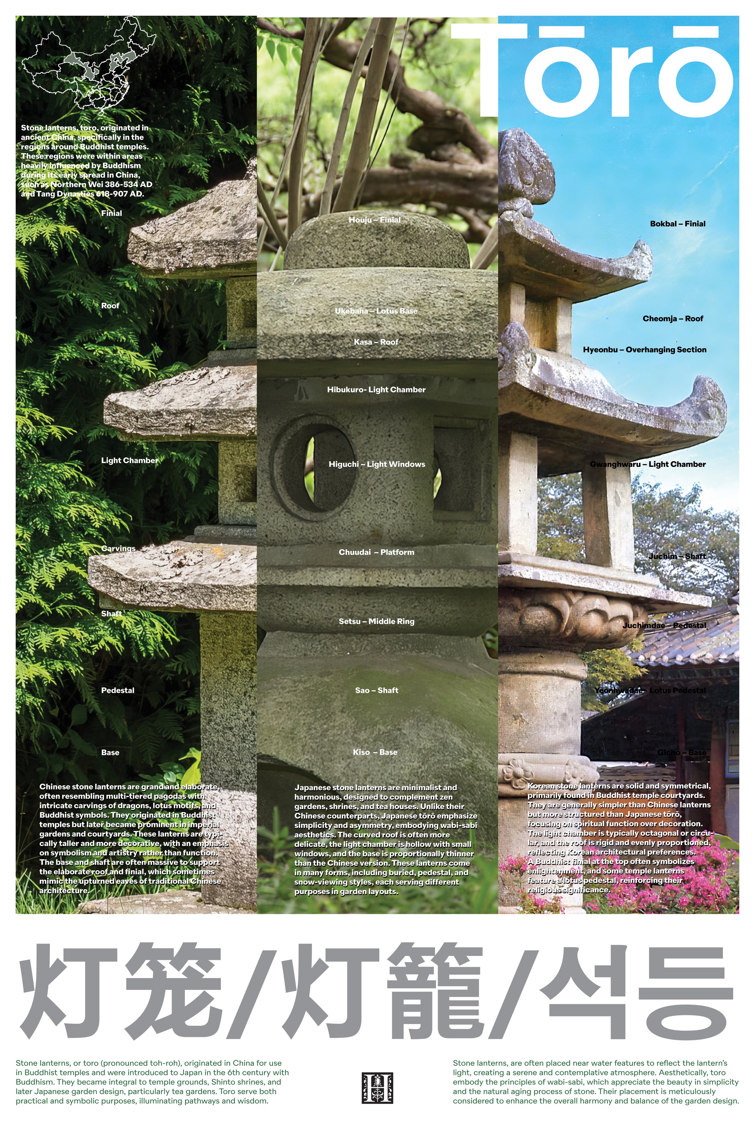
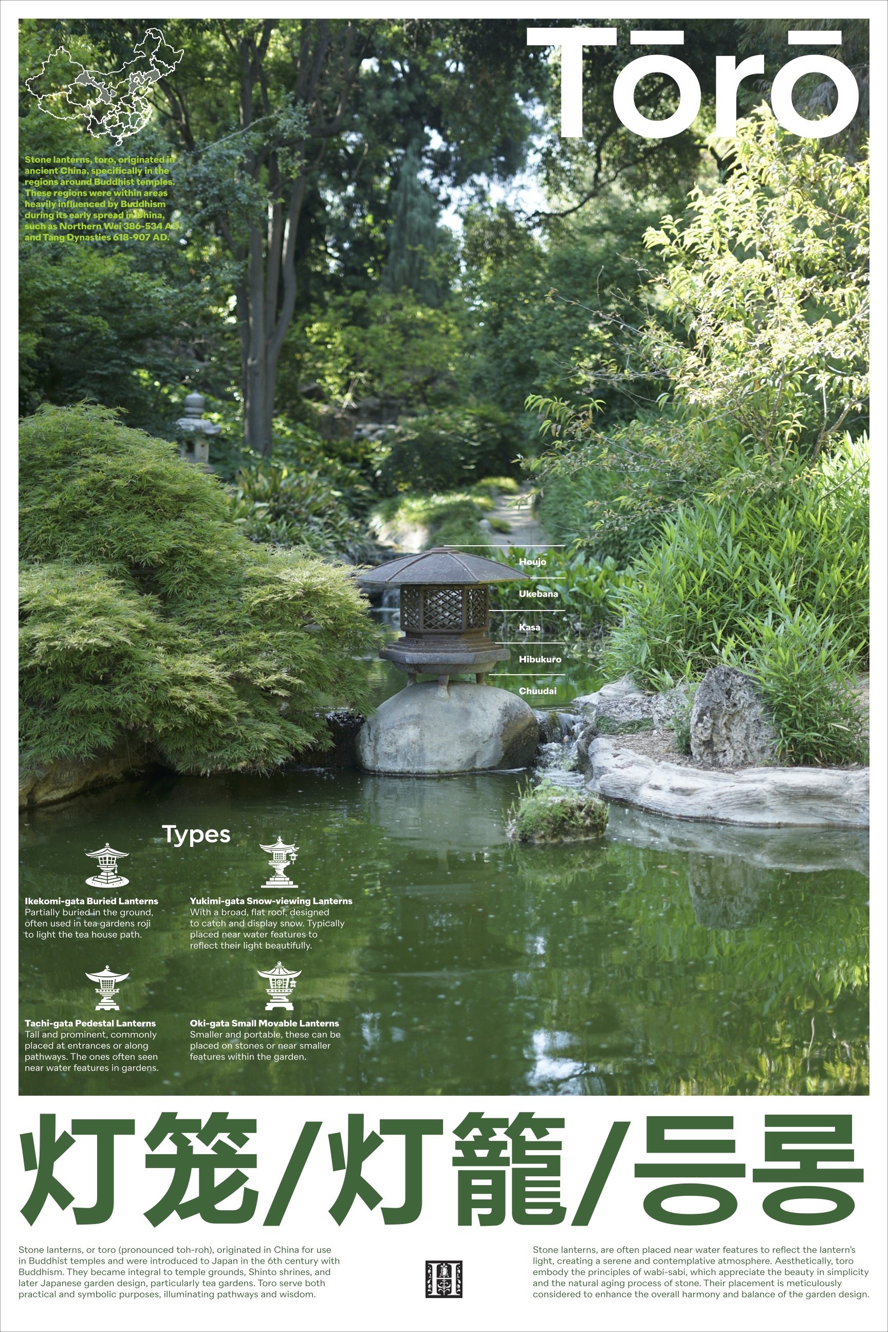
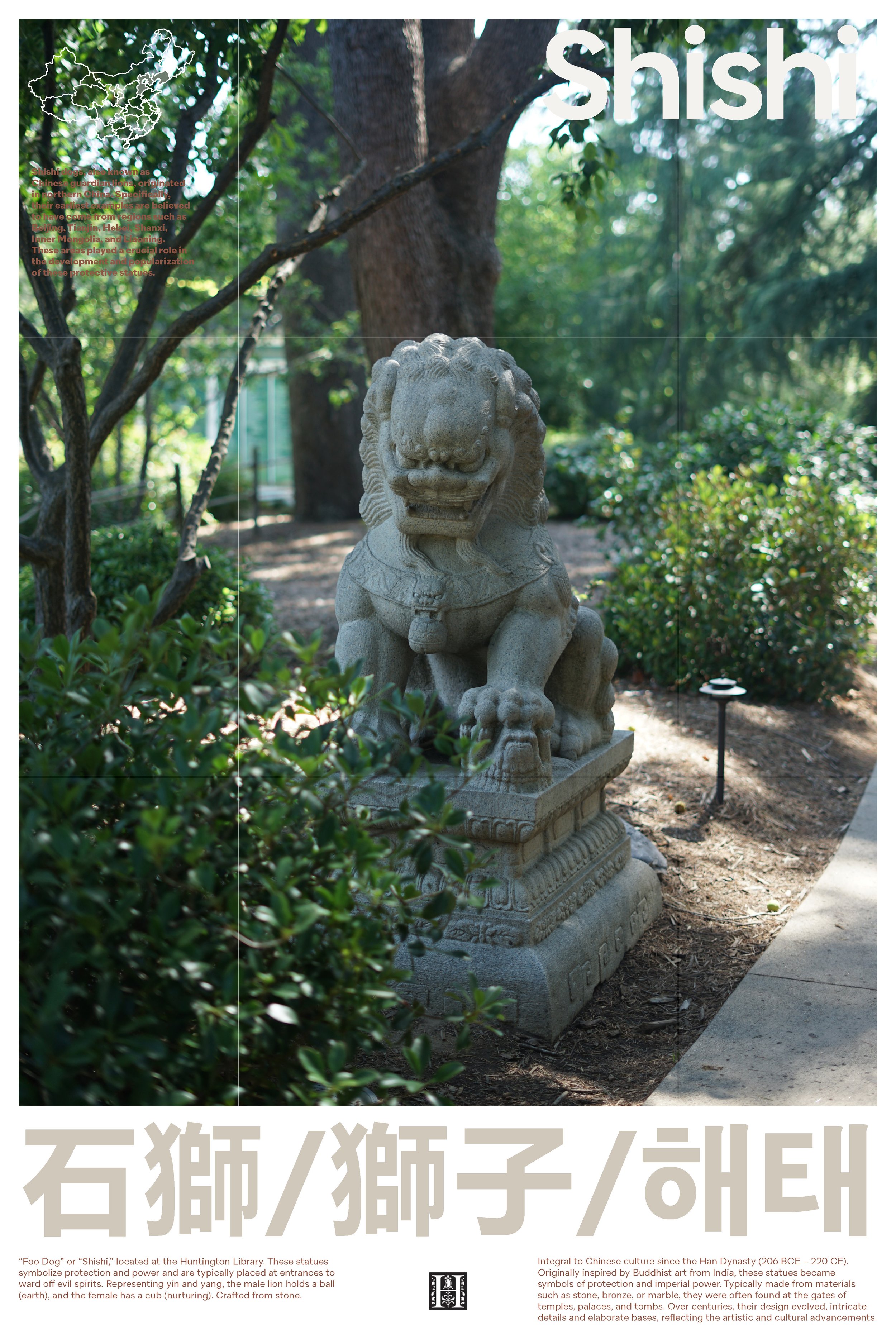
This infographic presents a comparative visual study of East Asian stone lanterns—Chinese (Dēnglóng), Japanese (Tōrō), and Korean (Seokdeung)—with a focus on their structural anatomy, cultural origins, and aesthetic distinctions. The design intention was to clarify and distinguish these often-confused lantern types, making the subtle yet significant differences accessible to a wider audience.
The visual layout adopts a structured triptych grid, separating the three lantern styles into clear vertical columns. This framework allows for direct side-by-side comparison, encouraging viewers to understand not just their visual similarities but also the cultural and historical contexts behind each form.
The typographic system is restrained yet deliberate, blending modern sans-serif clarity with subtle traditional cues. Supporting elements such as regional maps, translated terminology, and detailed captions provide layered information without overwhelming the viewer. A muted, earthy color palette—pulled from natural stone and foliage—anchors the narrative while paying homage to the organic materials of the lanterns themselves.
At the heart of this design is a reflection on cultural continuity and regional interpretation. The infographic unpacks how a singular form—the stone lantern—was adapted across China, Japan, and Korea, evolving in form, symbolism, and placement based on each country’s architectural and religious influences.
As a Korean myself, I approached this project with curiosity and clarity, aware that these forms are often misidentified or generalized. This infographic aims to bridge that gap, providing an accessible, well-structured reference that highlights both the shared heritage and the nuanced differences of these lanterns within East Asian landscape design.