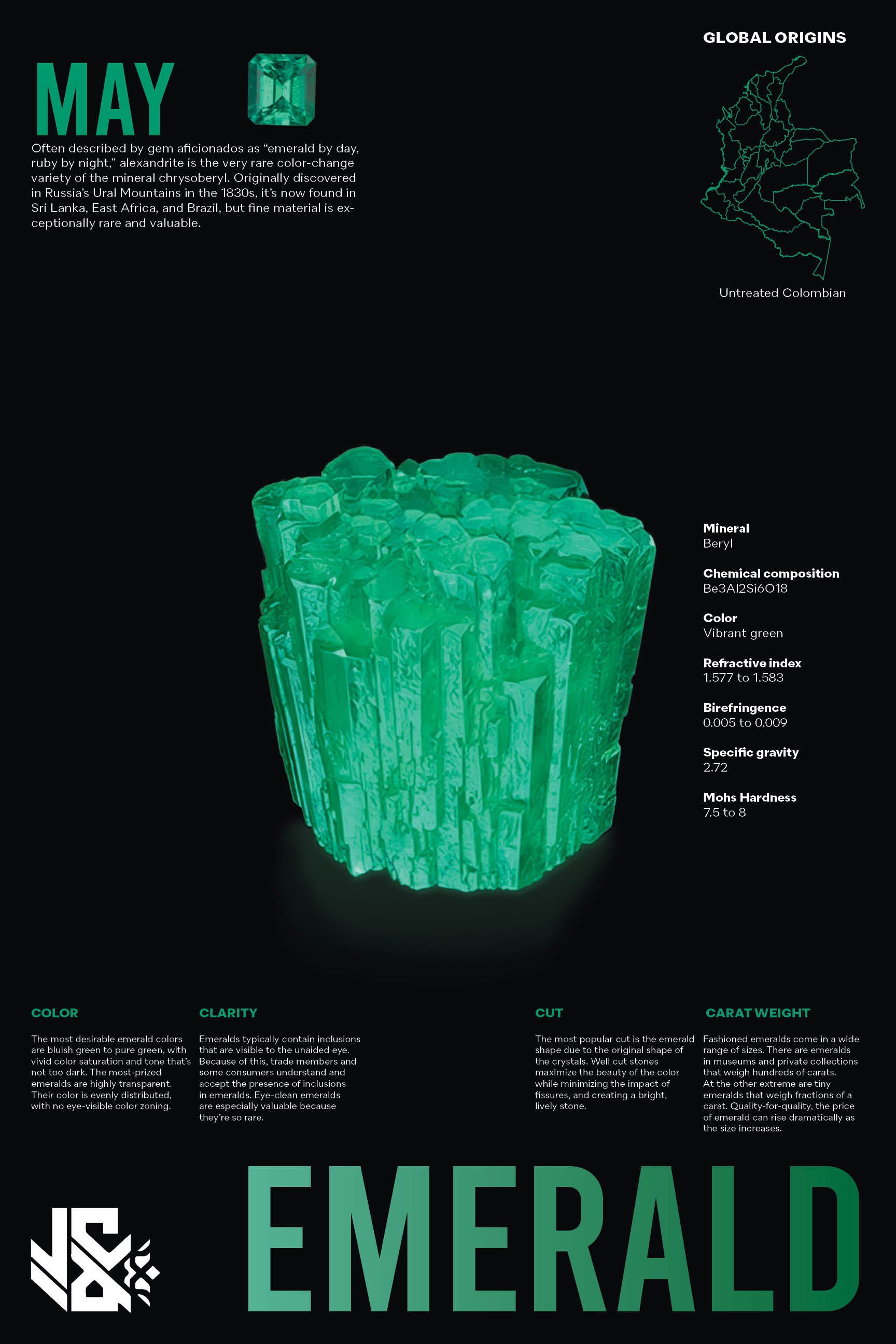
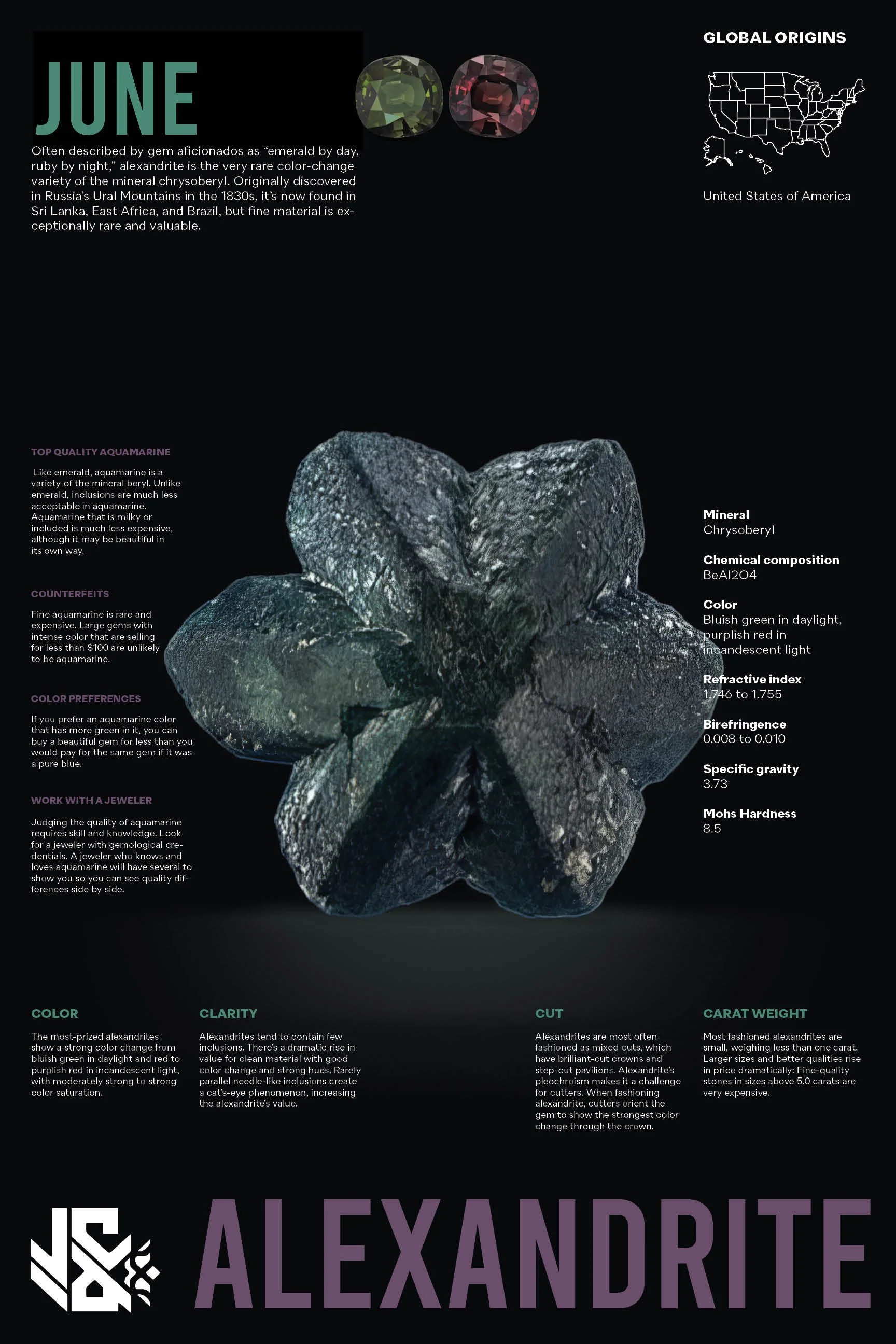
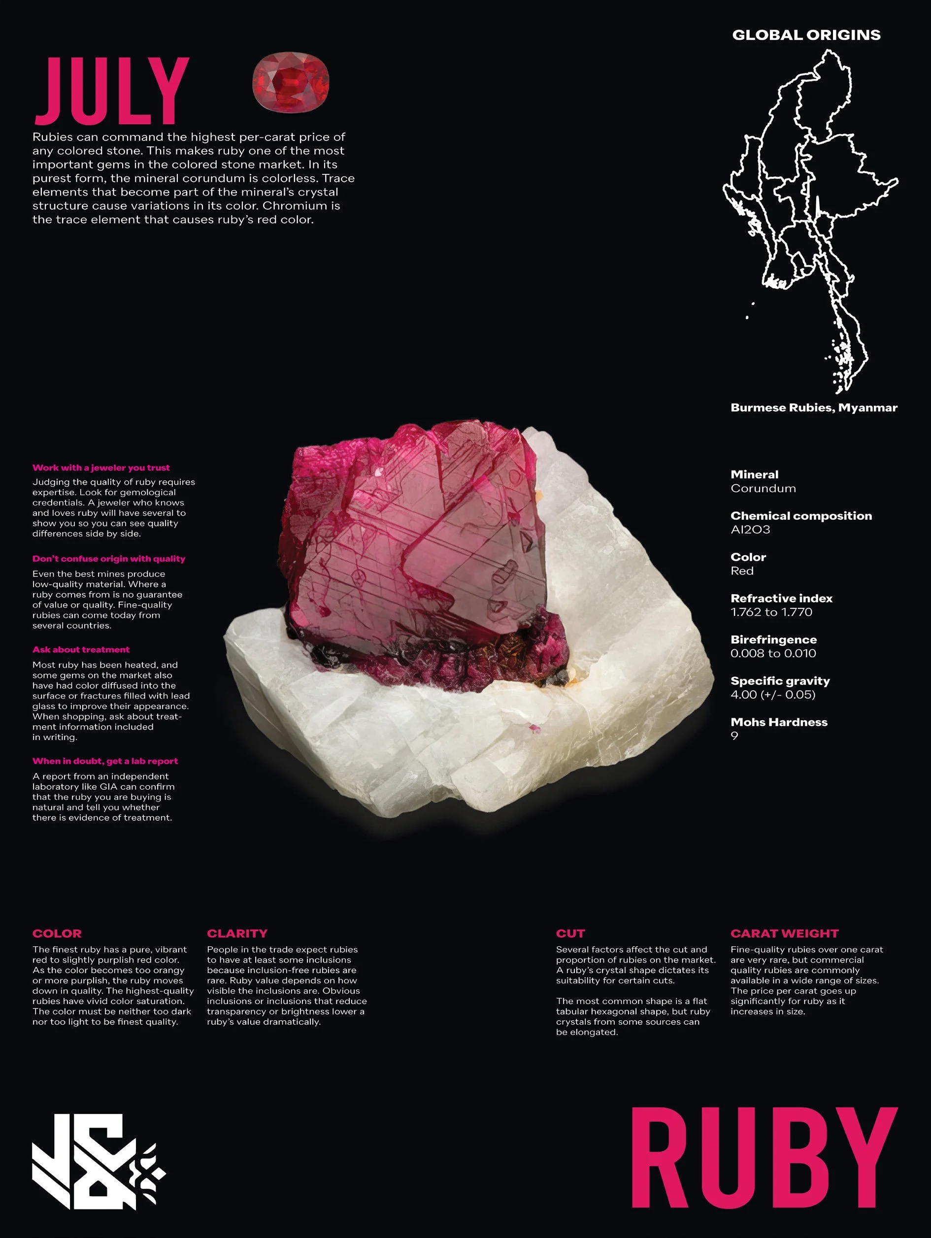
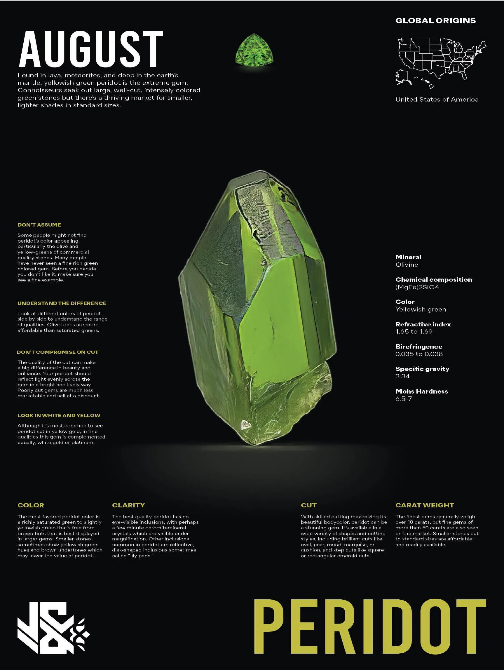
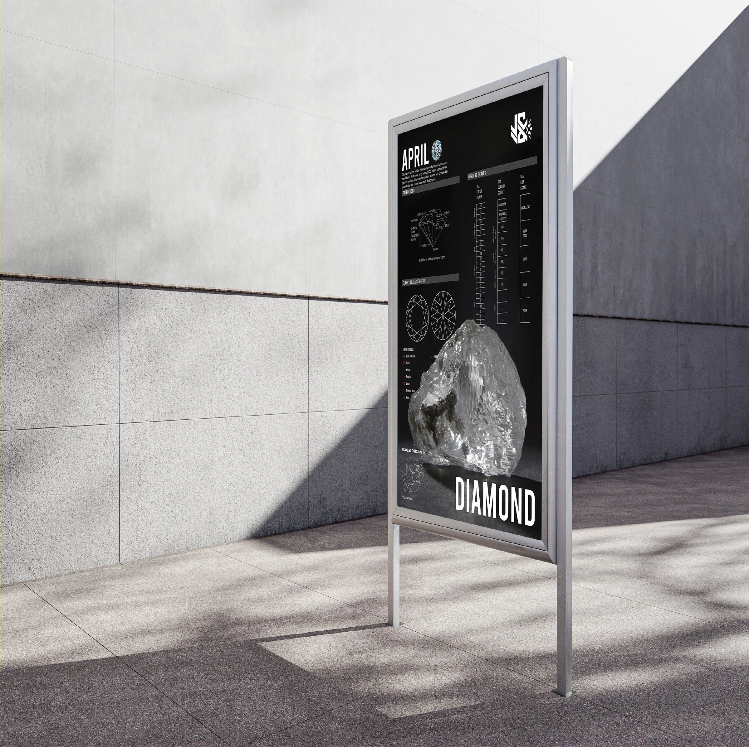
As part of the Jacob & Co. rebrand, this infographic series was developed to elevate the customer experience by offering a deeper, more personal understanding of each birthstone. The design approach blends luxury aesthetics with educational clarity, creating a unique point of engagement for clients exploring fine jewelry.
Each poster is meticulously crafted to reflect the brand’s core values of storytelling, craftsmanship, and exclusivity. Through a combination of structured layout, refined typographic hierarchy, and high-resolution gem photography, the series invites users to learn not only about the origins and symbolism of their birthstone but also the essential knowledge behind its care, quality, and characteristics.
What sets this project apart is its intention to bridge emotional value with material knowledge. Too often, high jewelry brands overlook the opportunity to connect customers with the deeper narrative behind what they’re buying. These posters act as an educational tool, giving clients insight into industry grading standards, gemstone history, and global sourcing—all while reinforcing Jacob & Co.'s dedication to transparency, craftsmanship, and meaningful luxury.
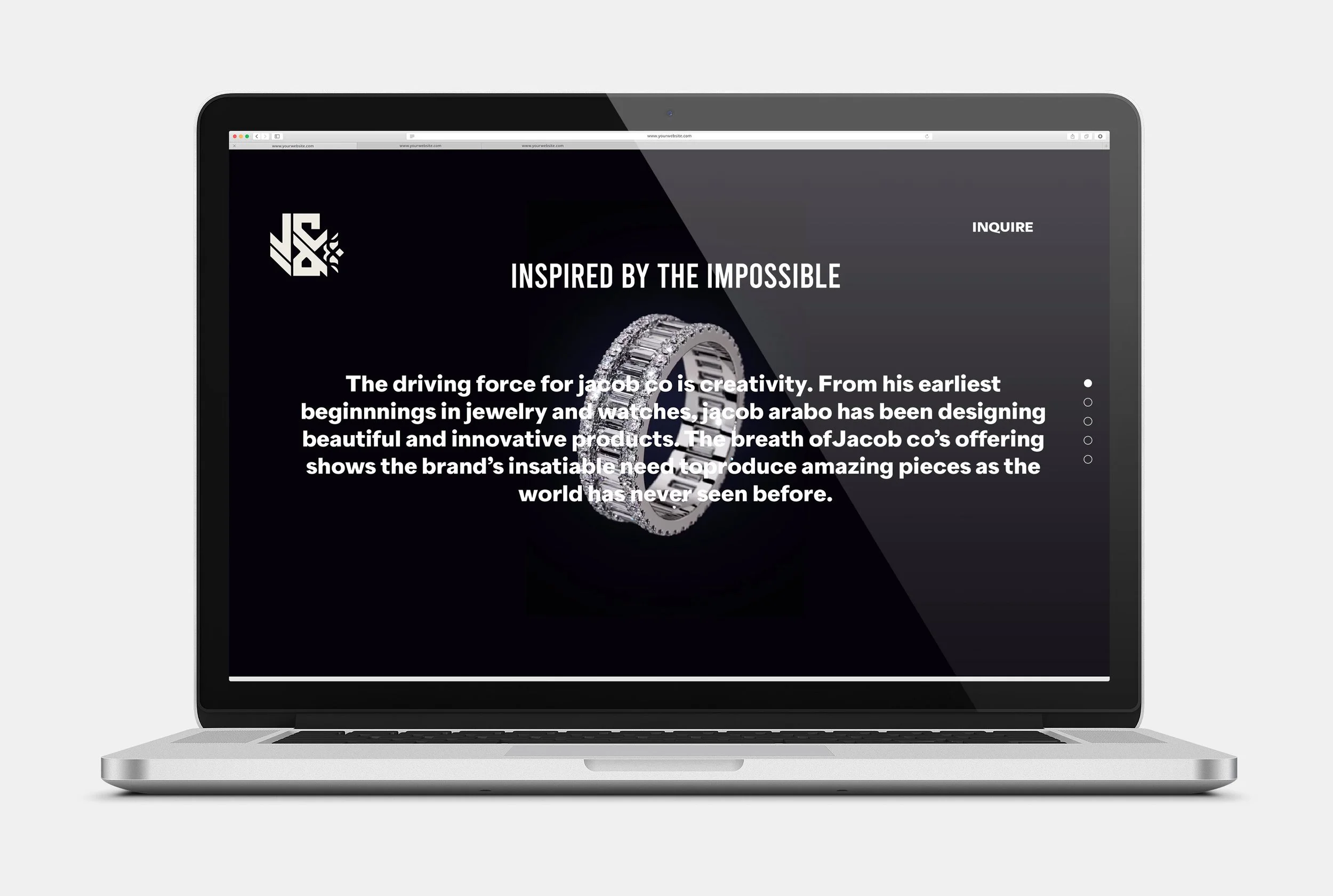
The result is a visual system that turns the act of purchasing fine jewelry into an immersive, informed experience, positioning Jacob & Co. as a brand that not only sells exceptional jewelry but also celebrates the unique story behind every stone.