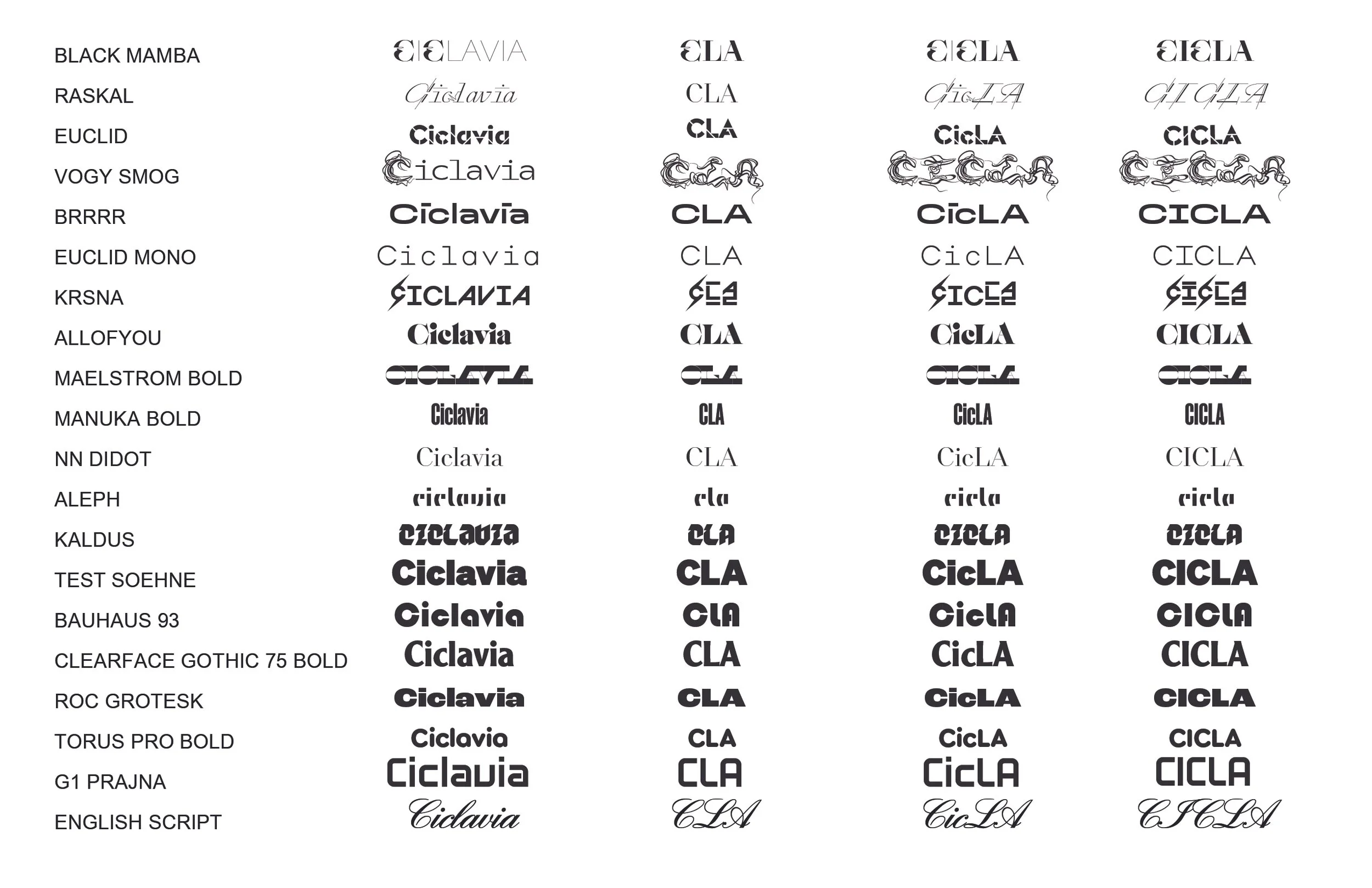
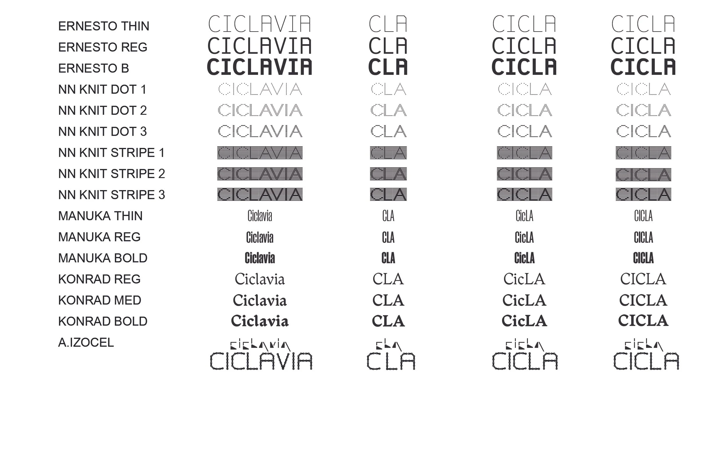
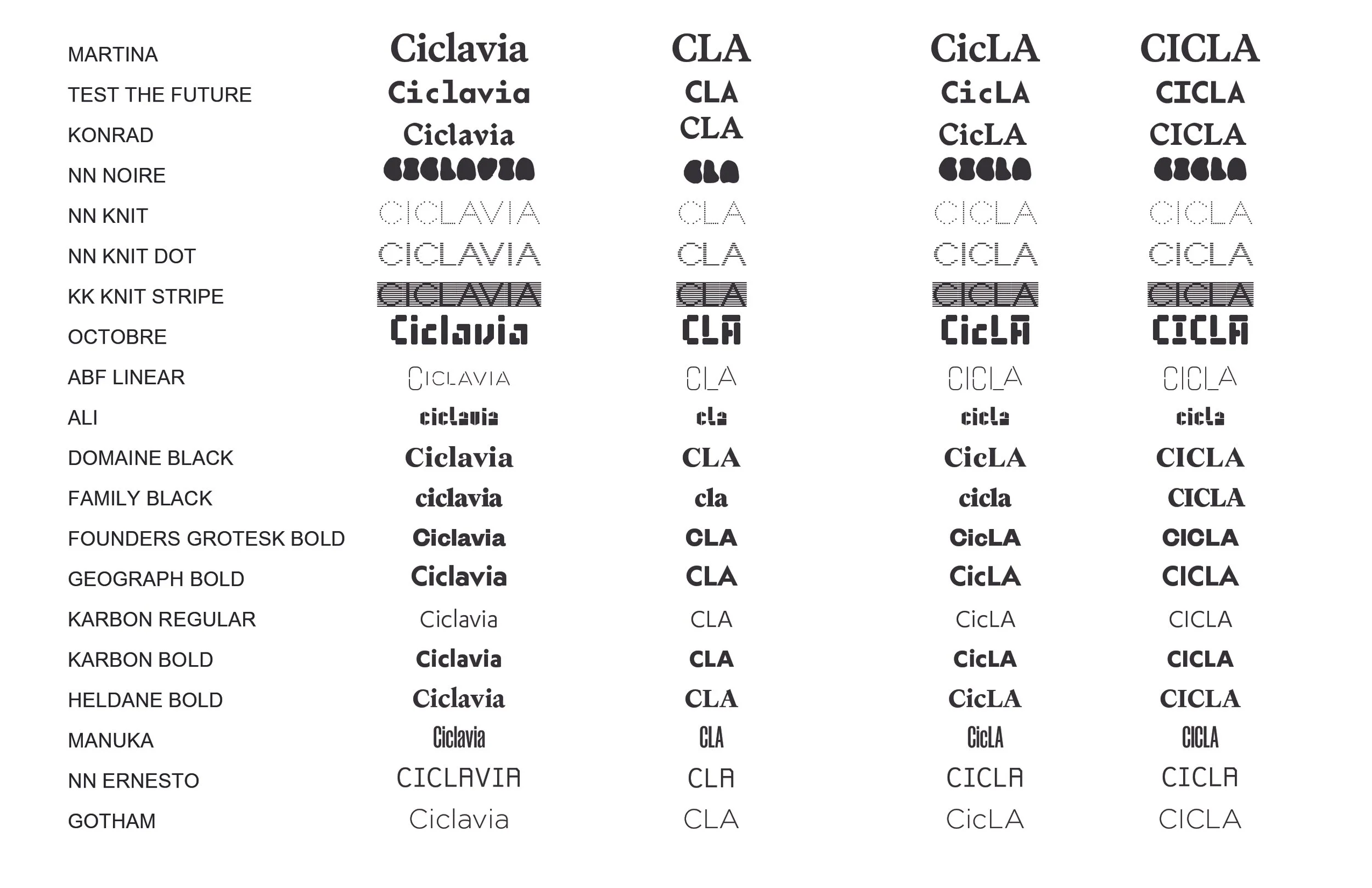
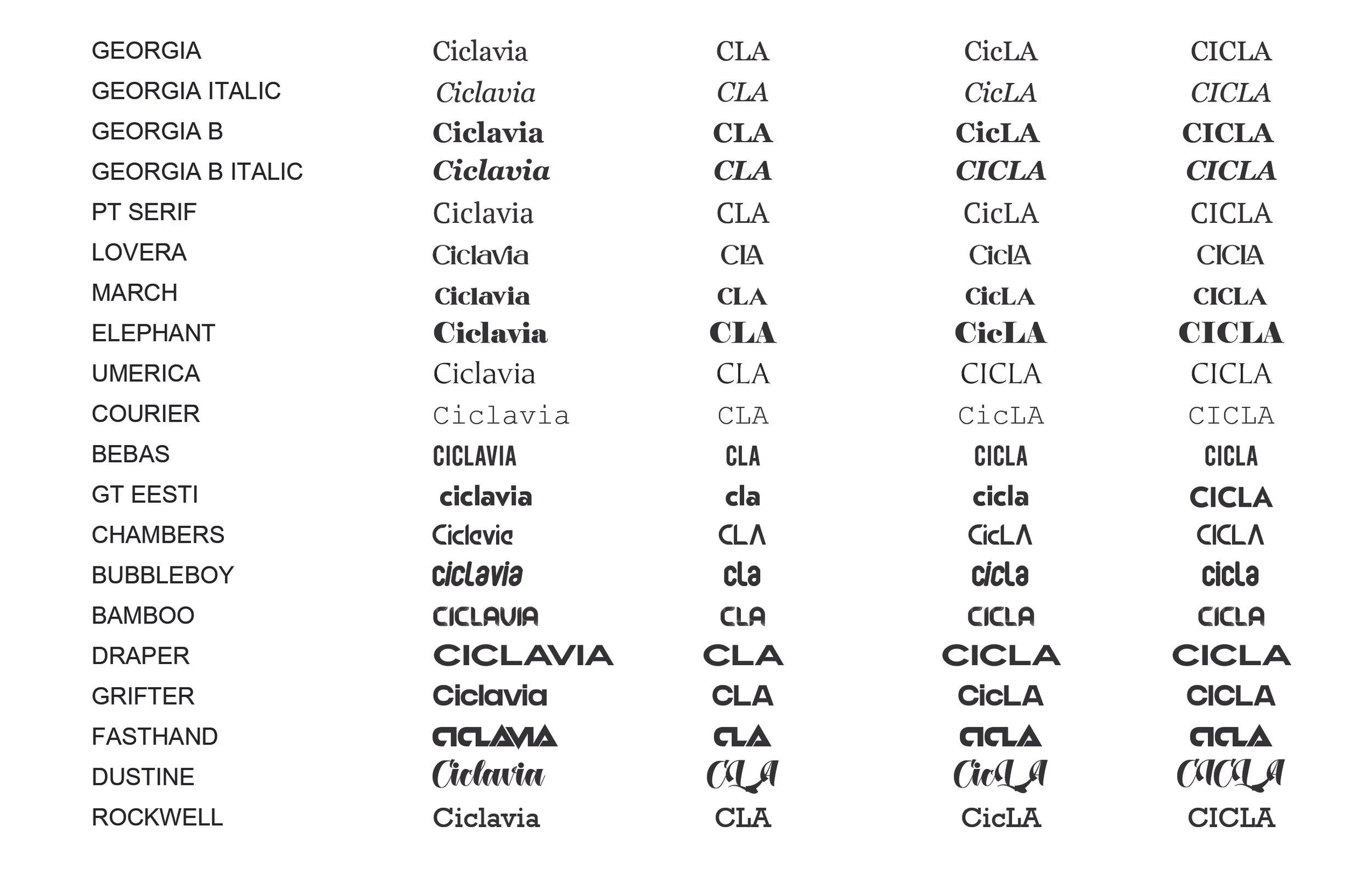
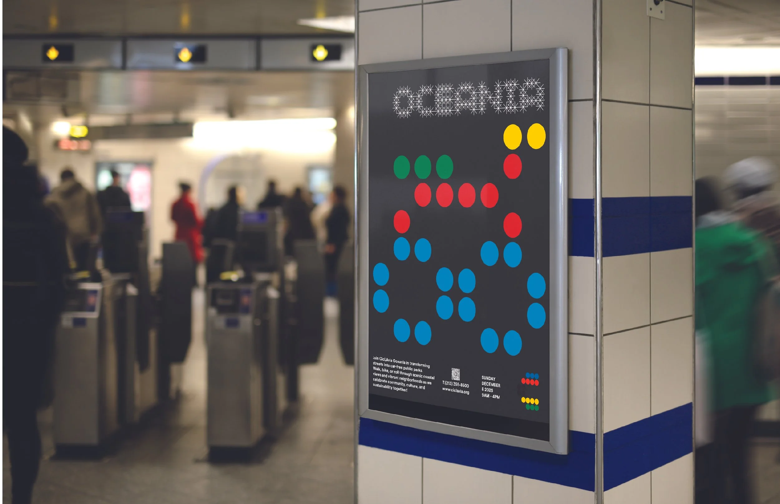
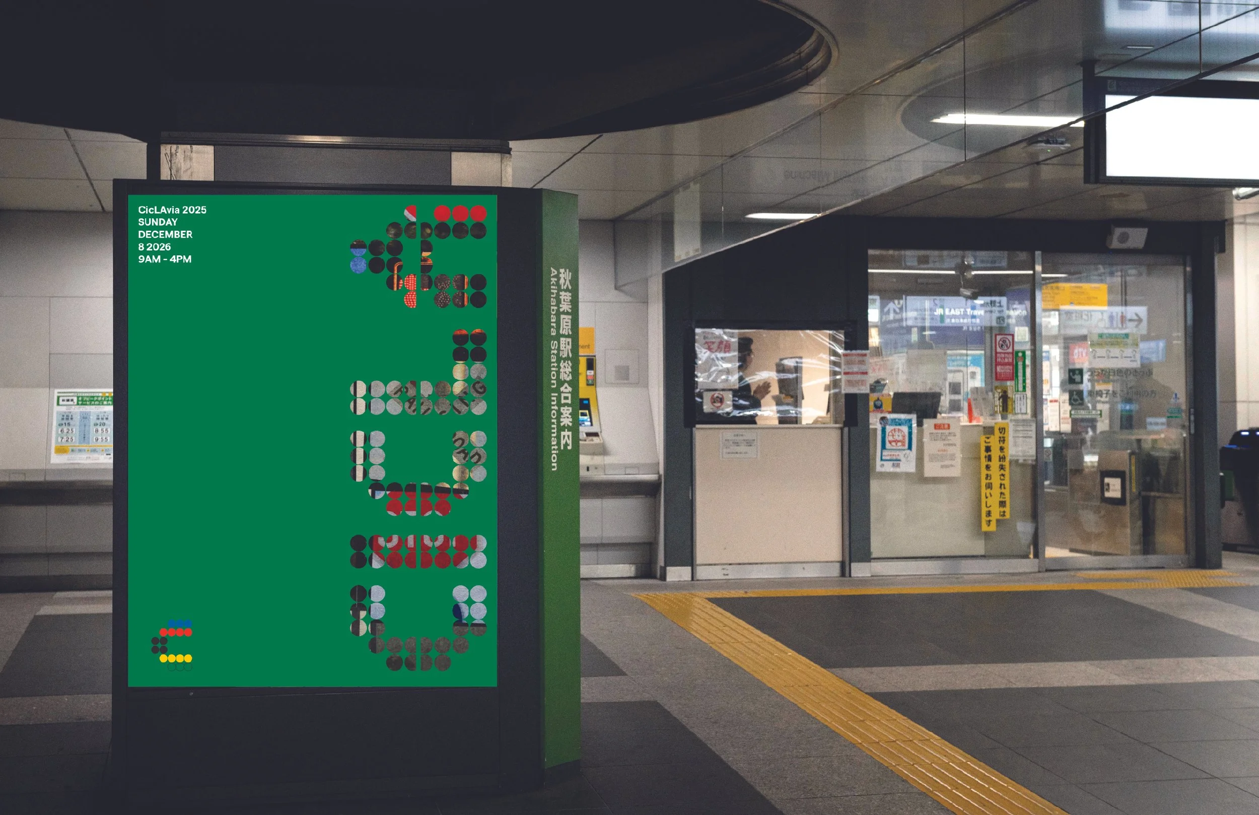
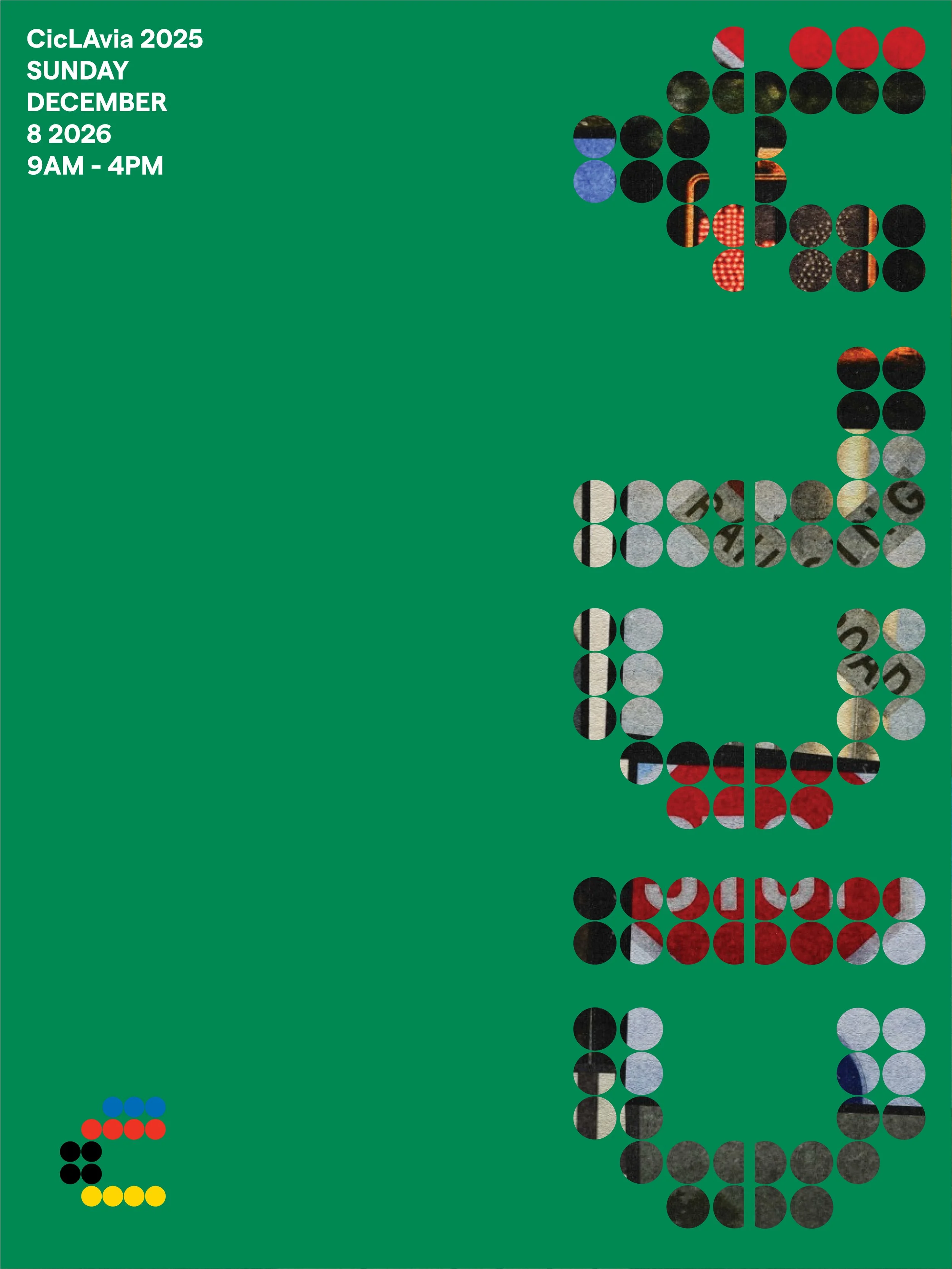
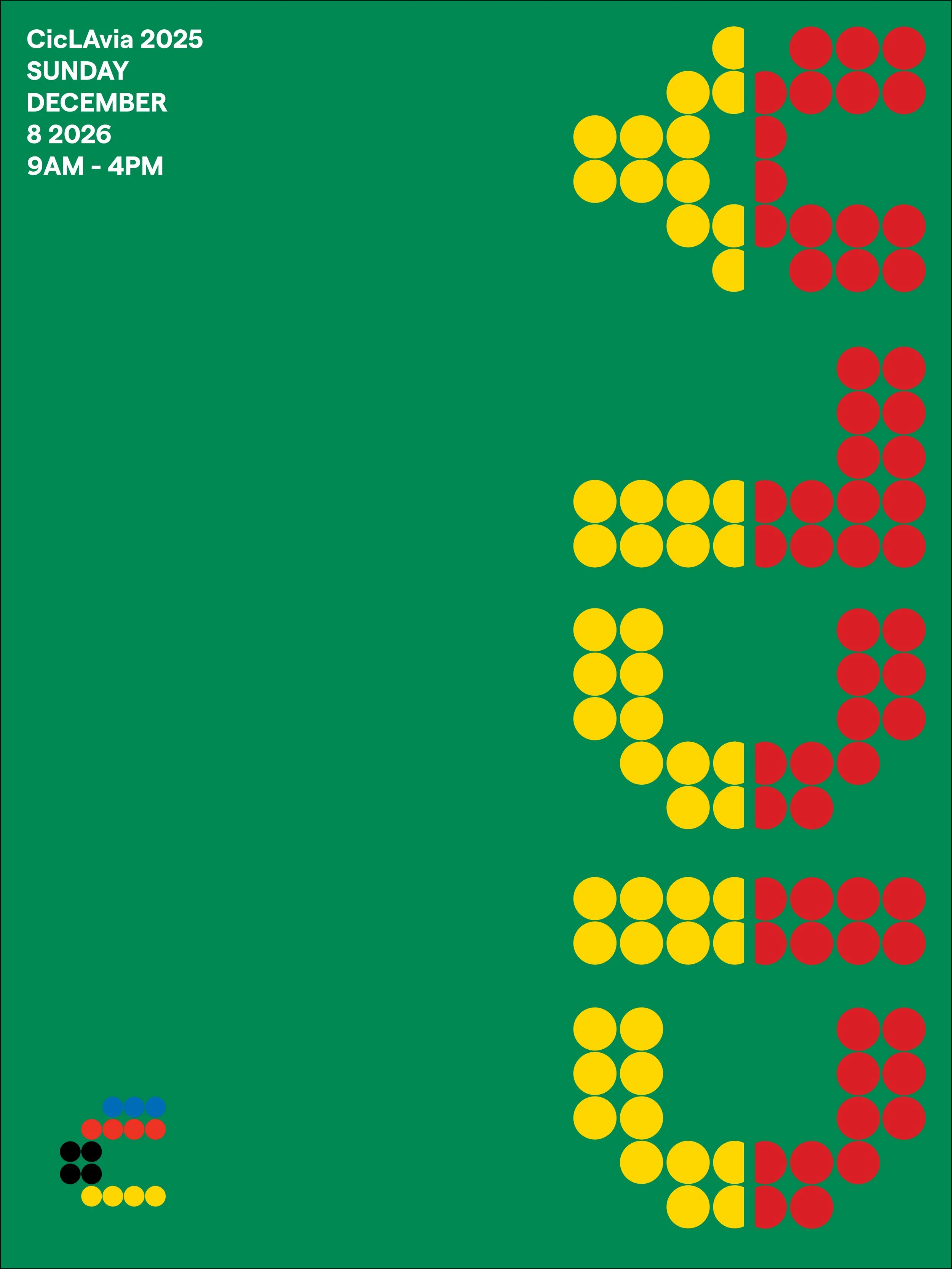
This rebrand of CicLAvia repositions the event with a design system rooted in bicycle culture, street safety, and global community engagement. As both a designer and an active cyclist, I approached this project not from an outsider’s aesthetic lens, but from lived experience — informed by the visual language, trends, and energy that actually resonate within bike culture.
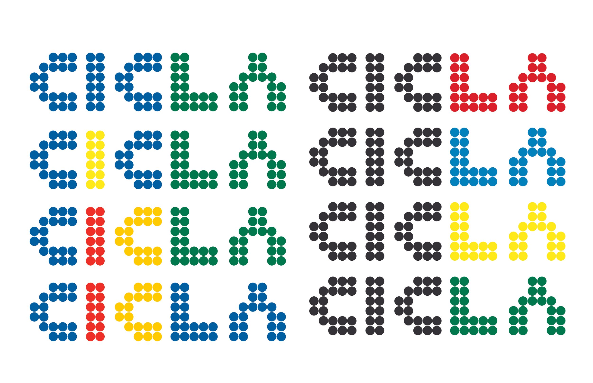
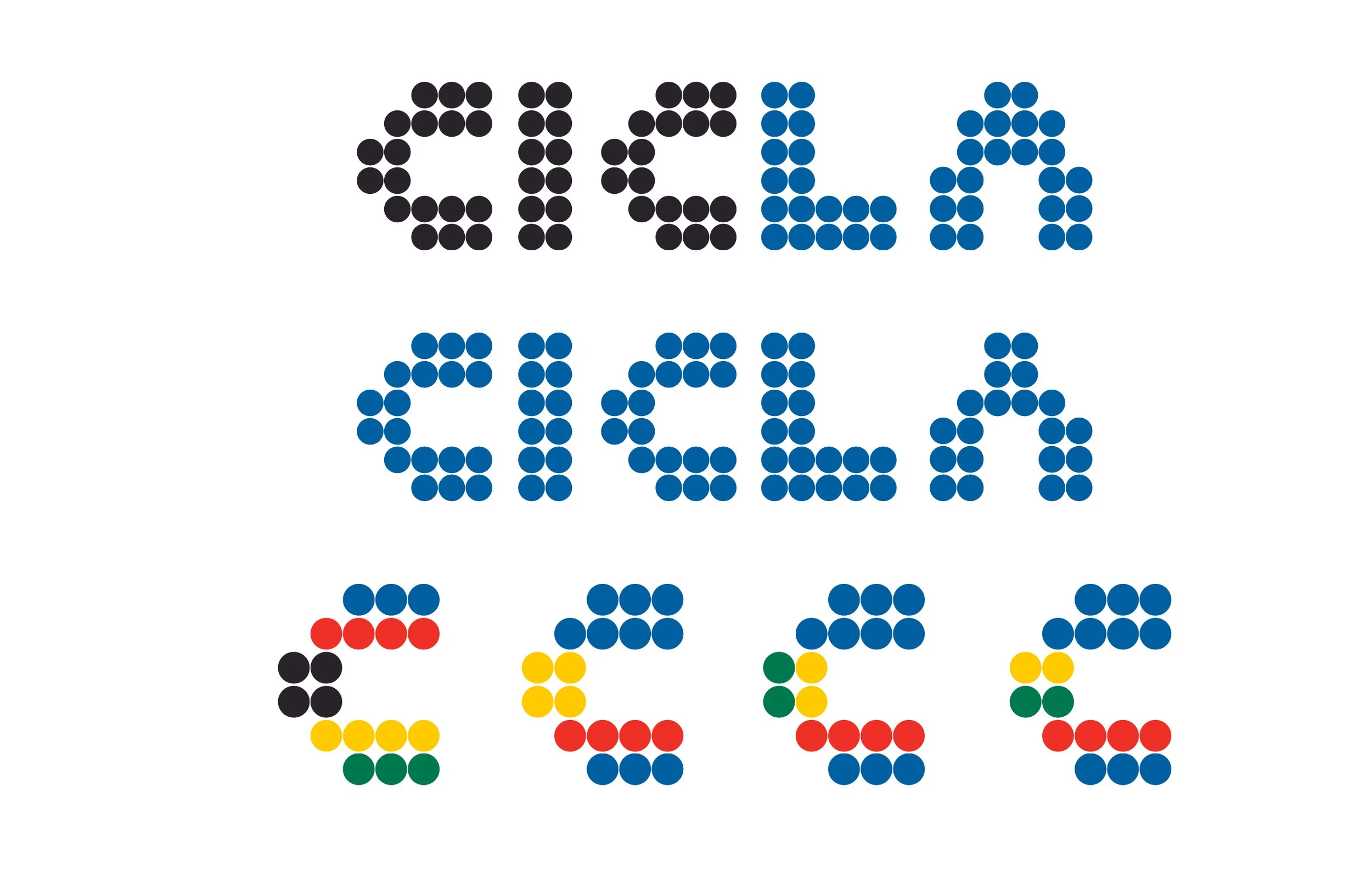
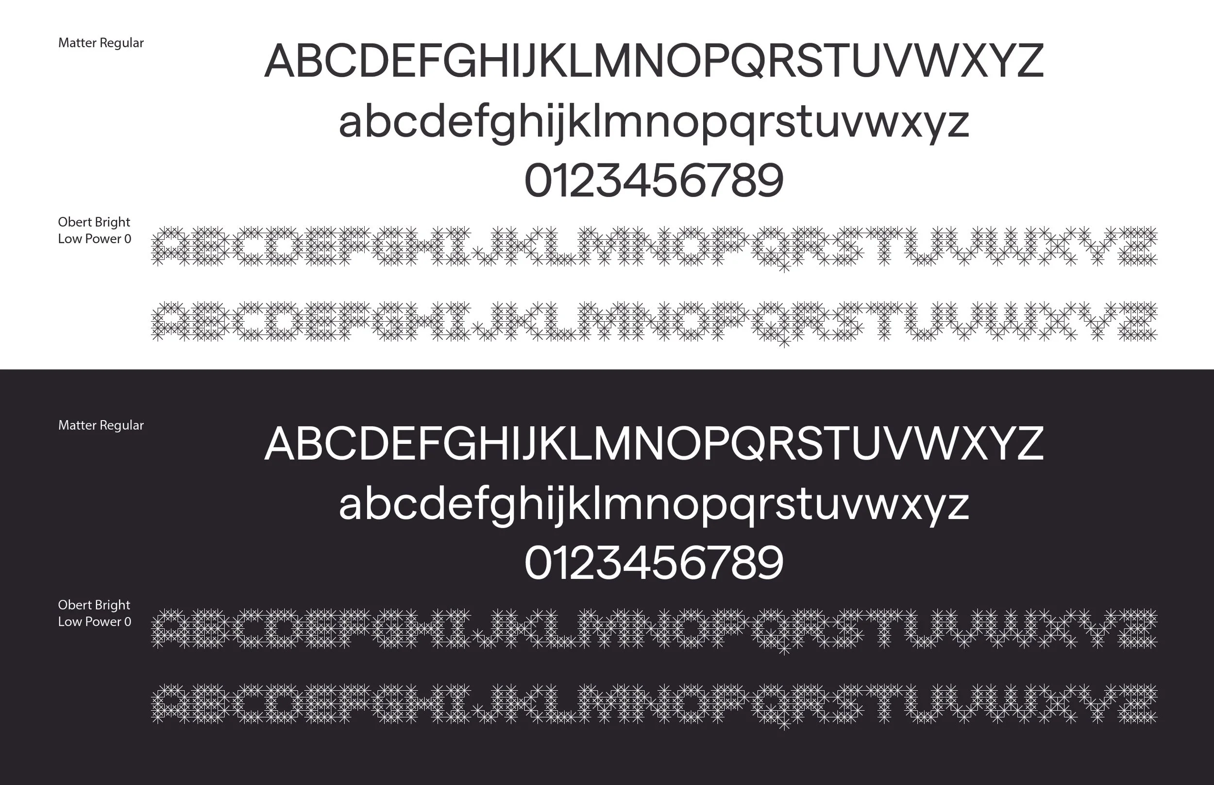
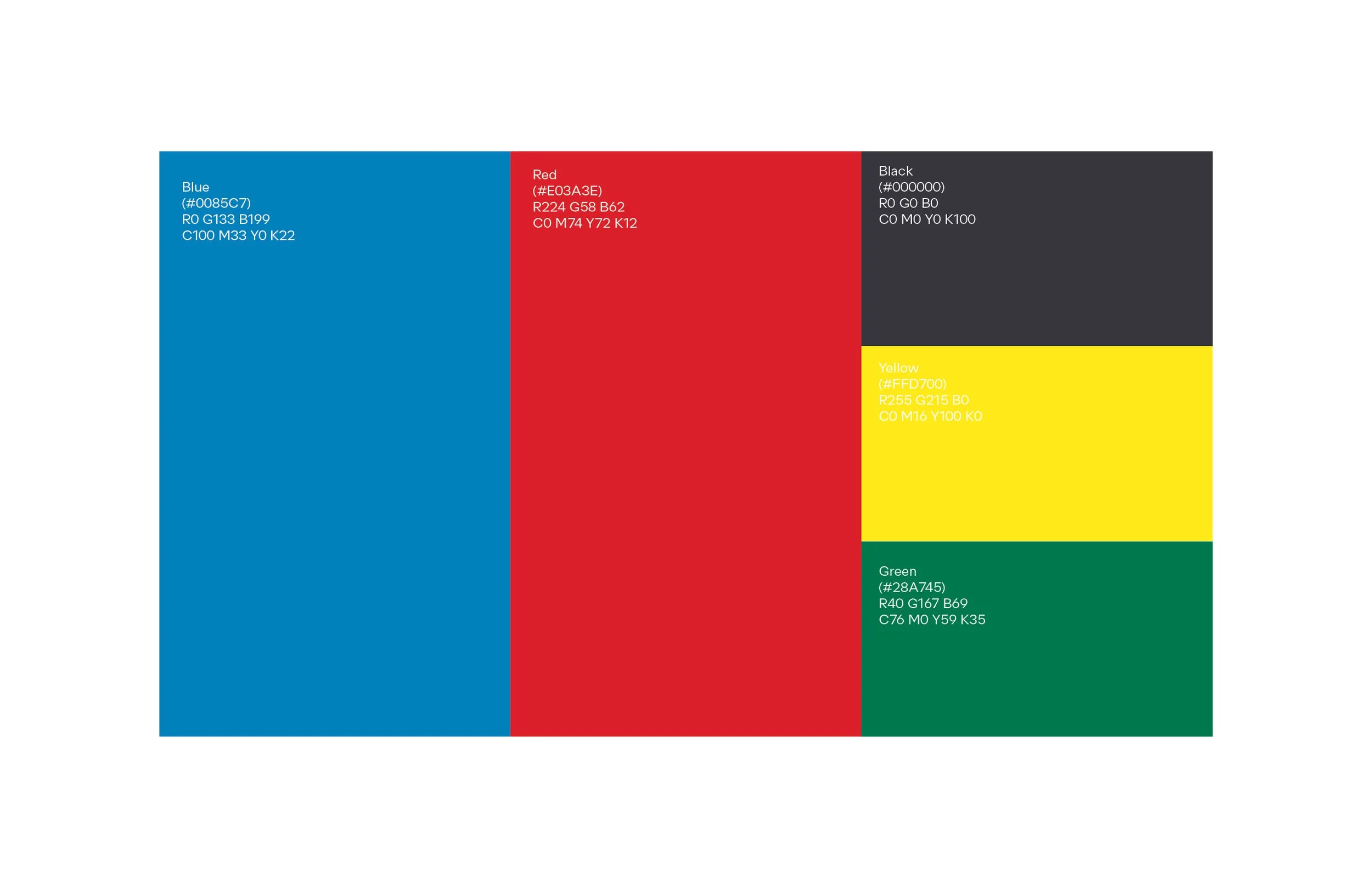
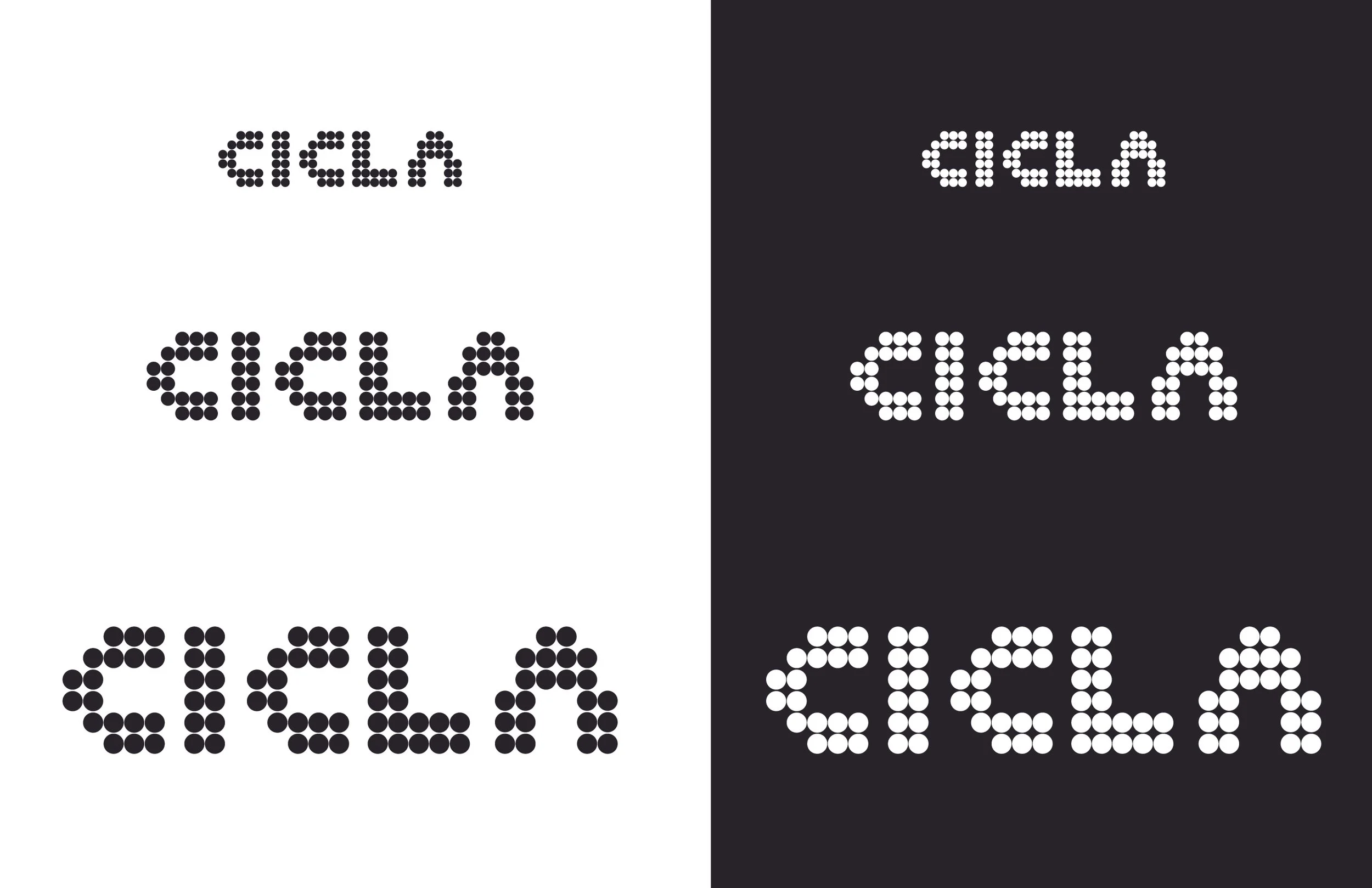
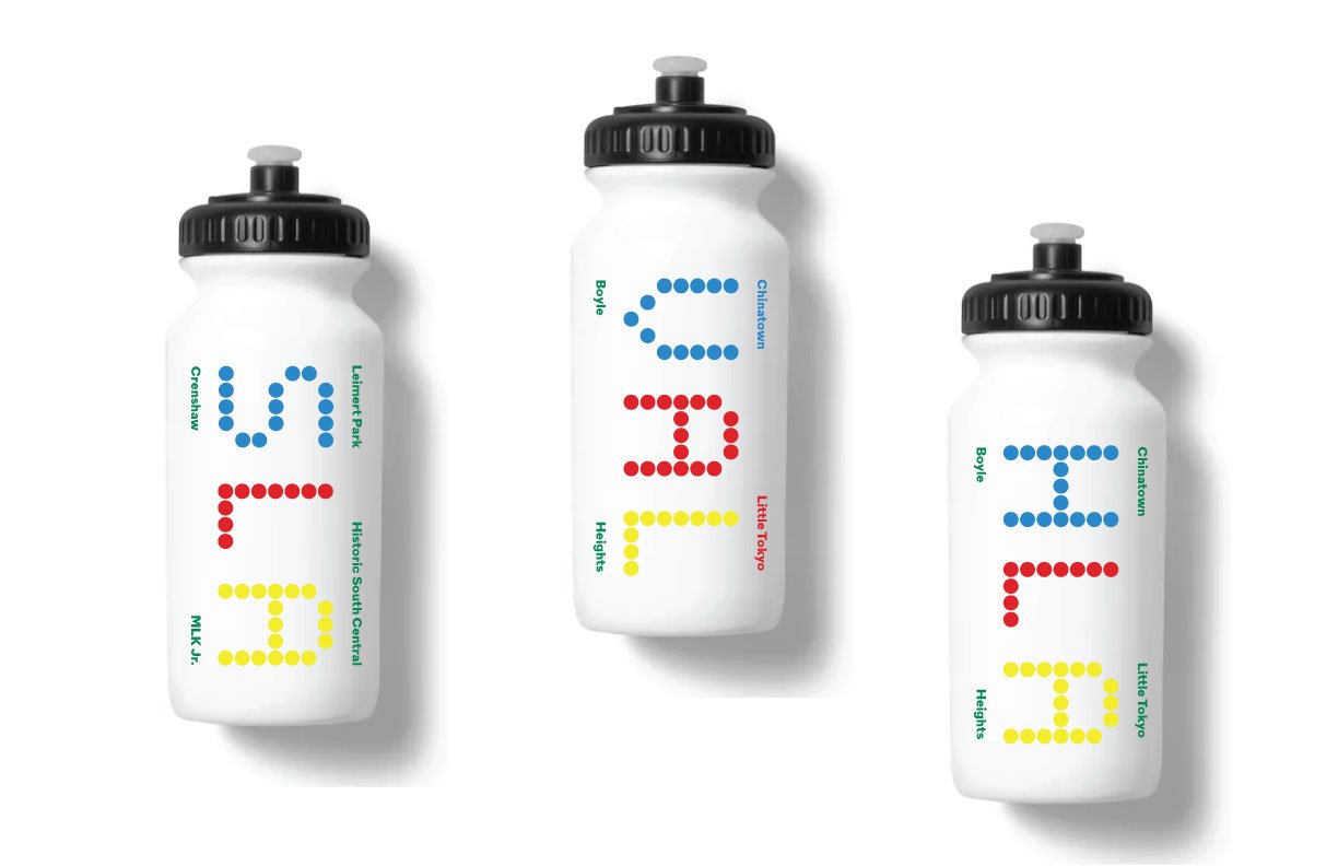
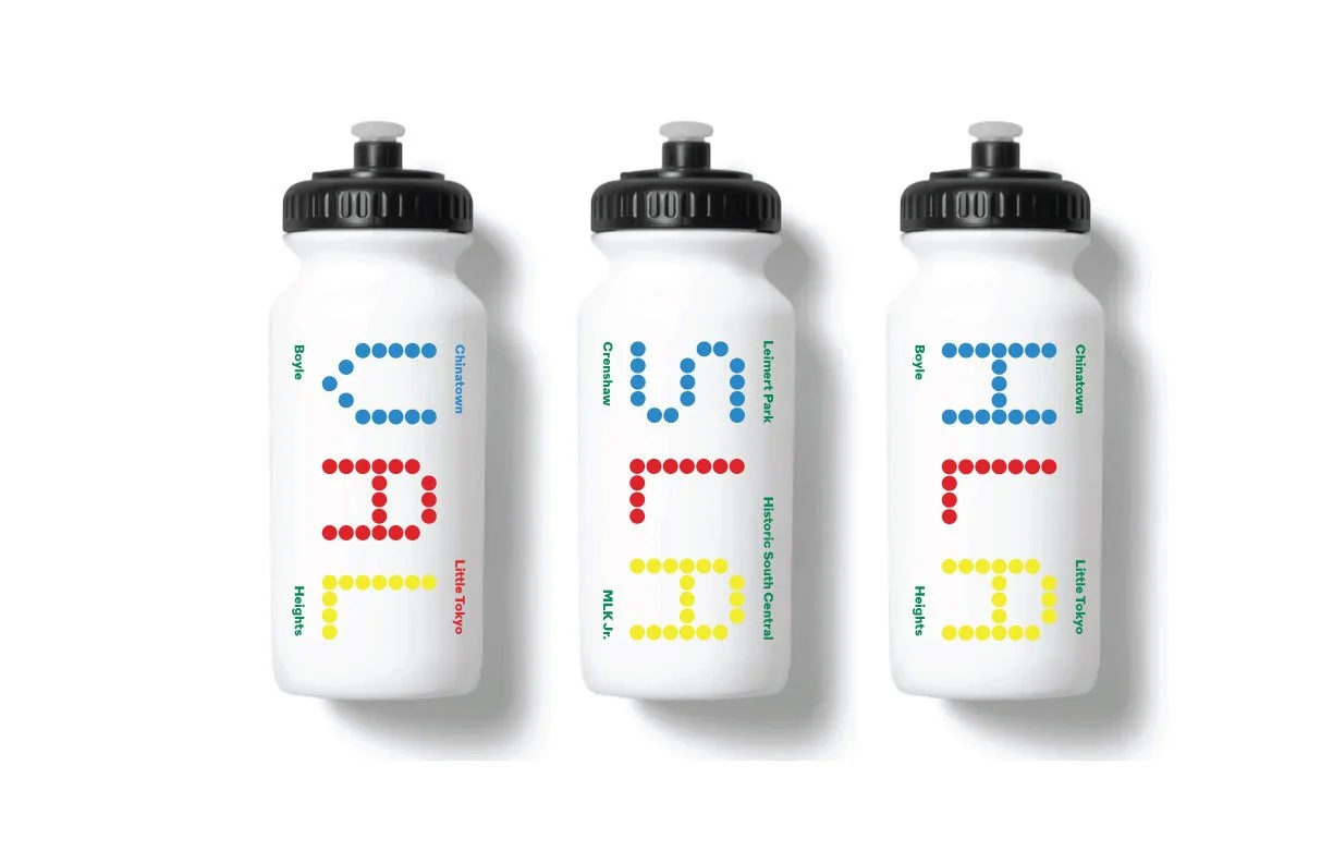
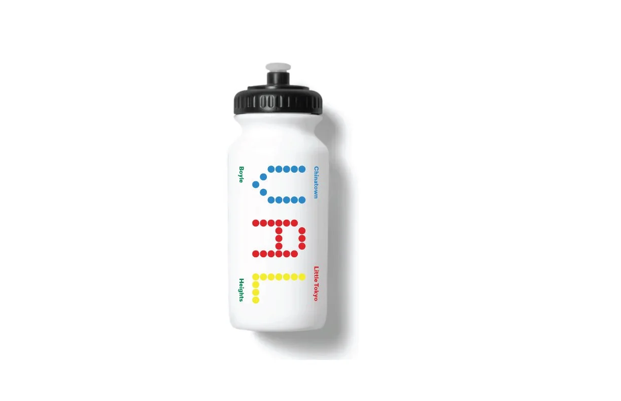
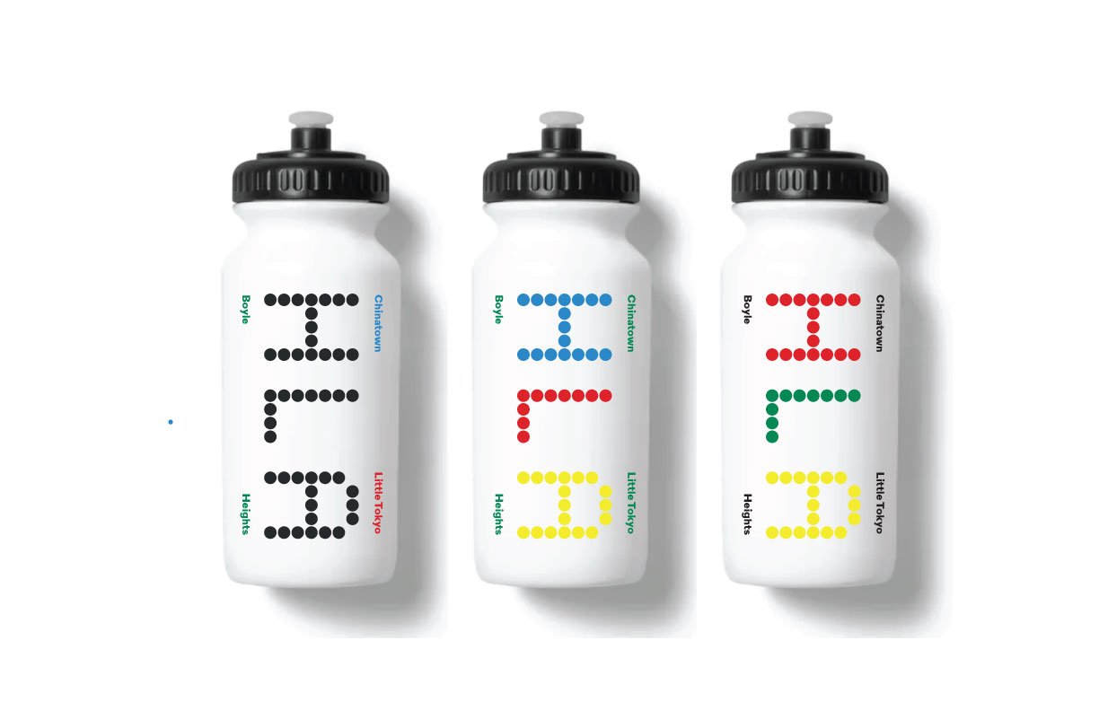
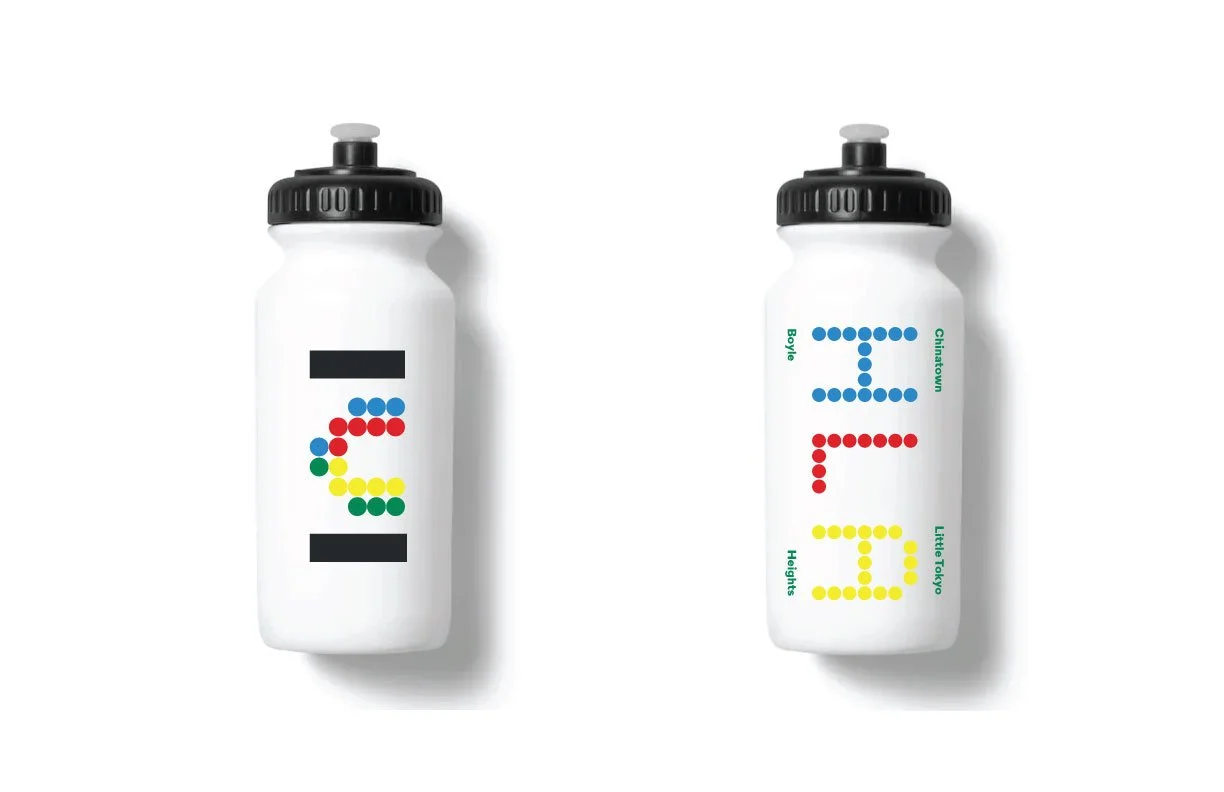
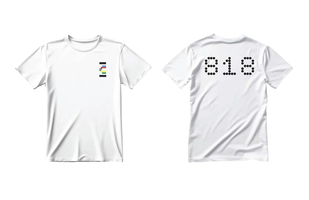
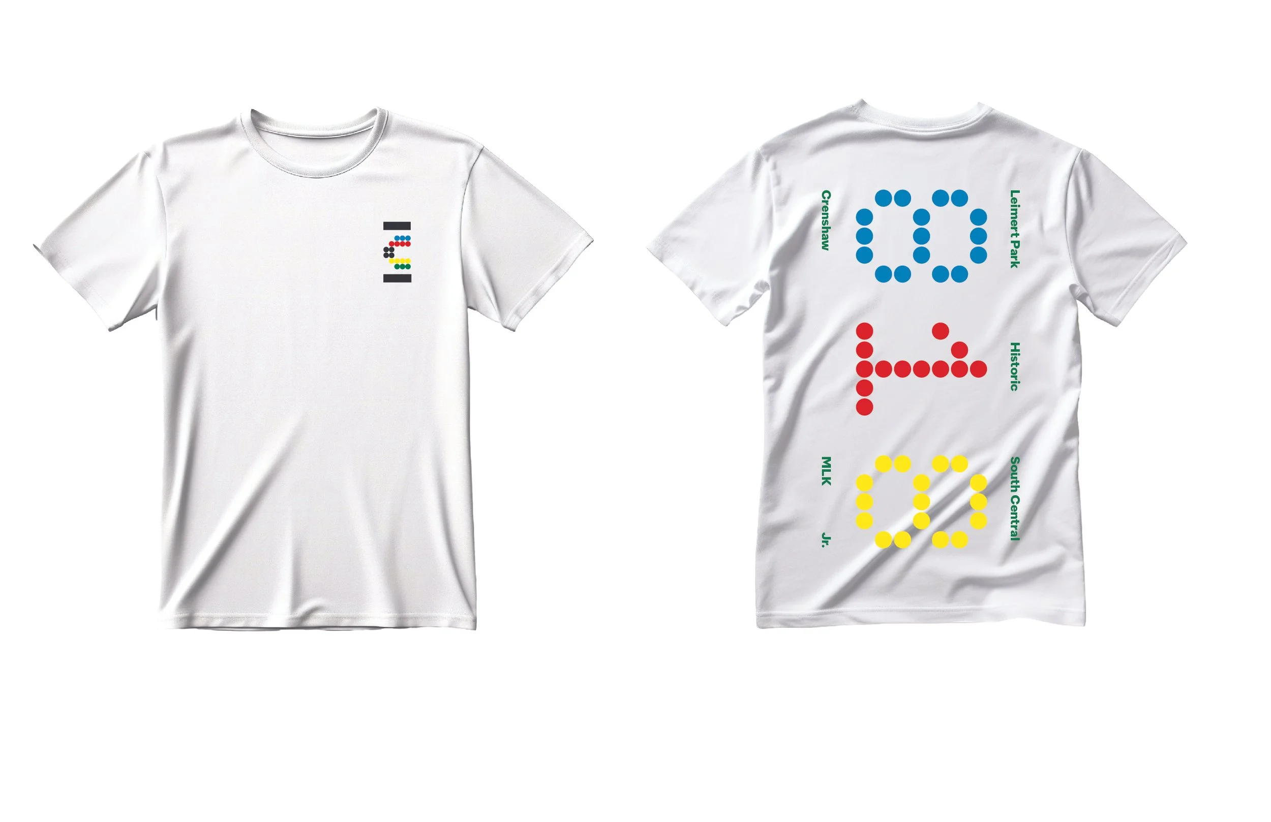
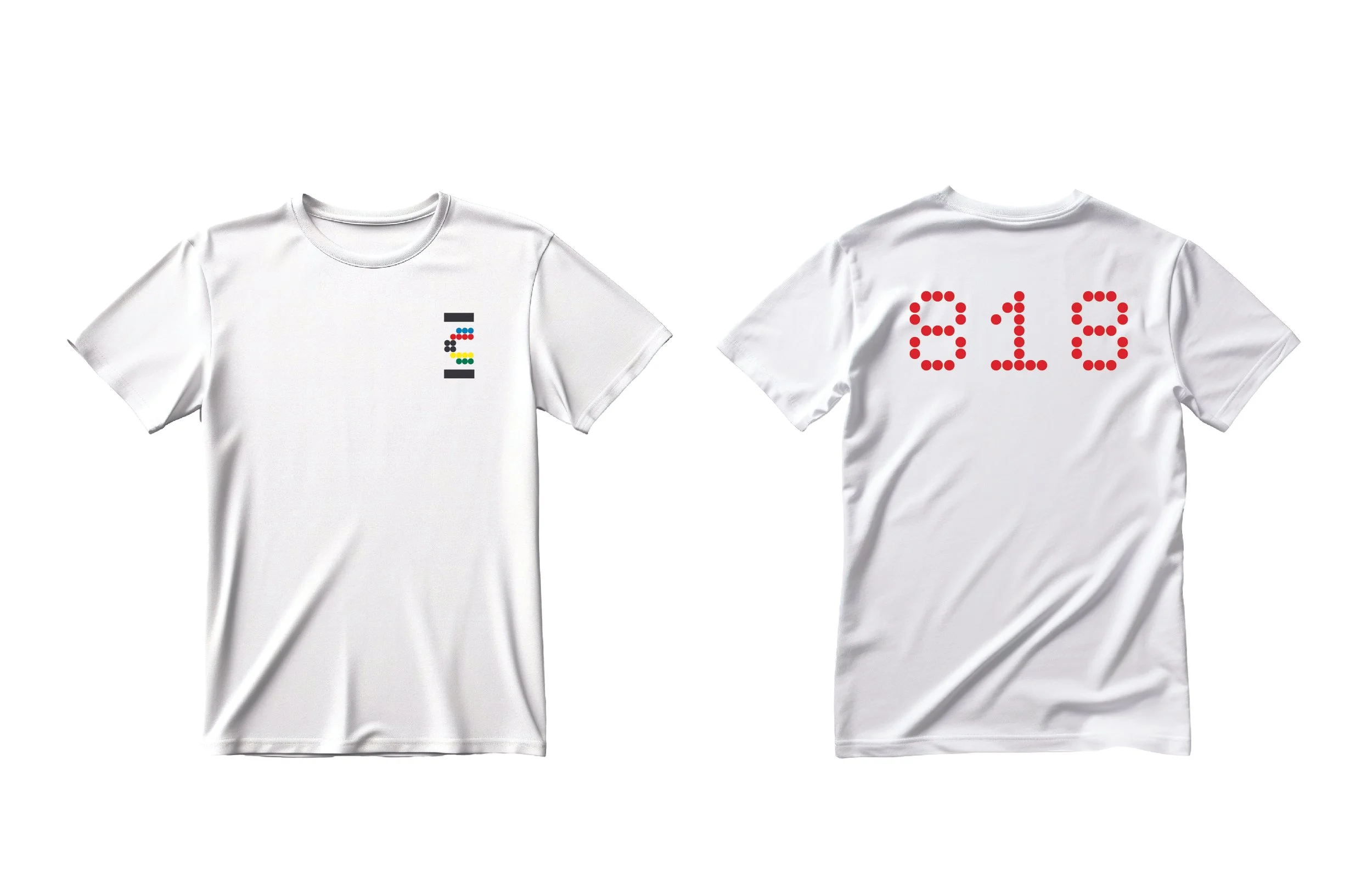
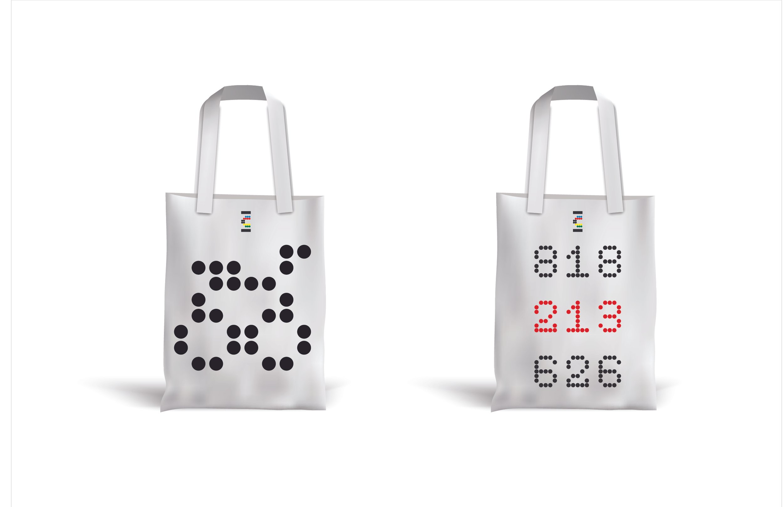
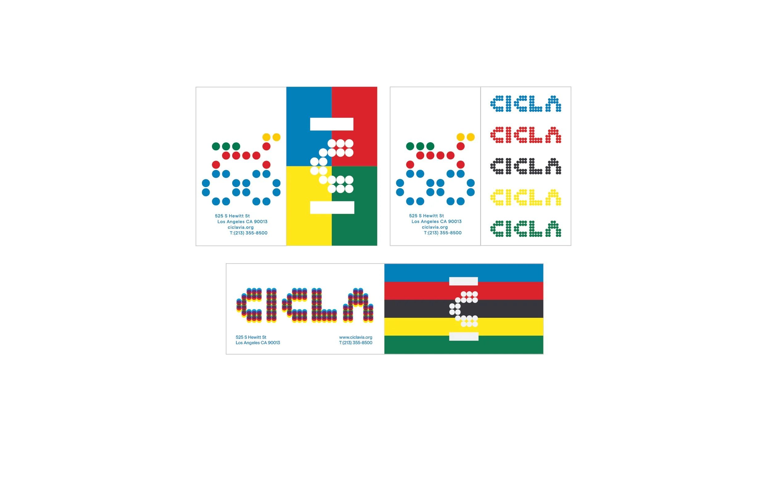
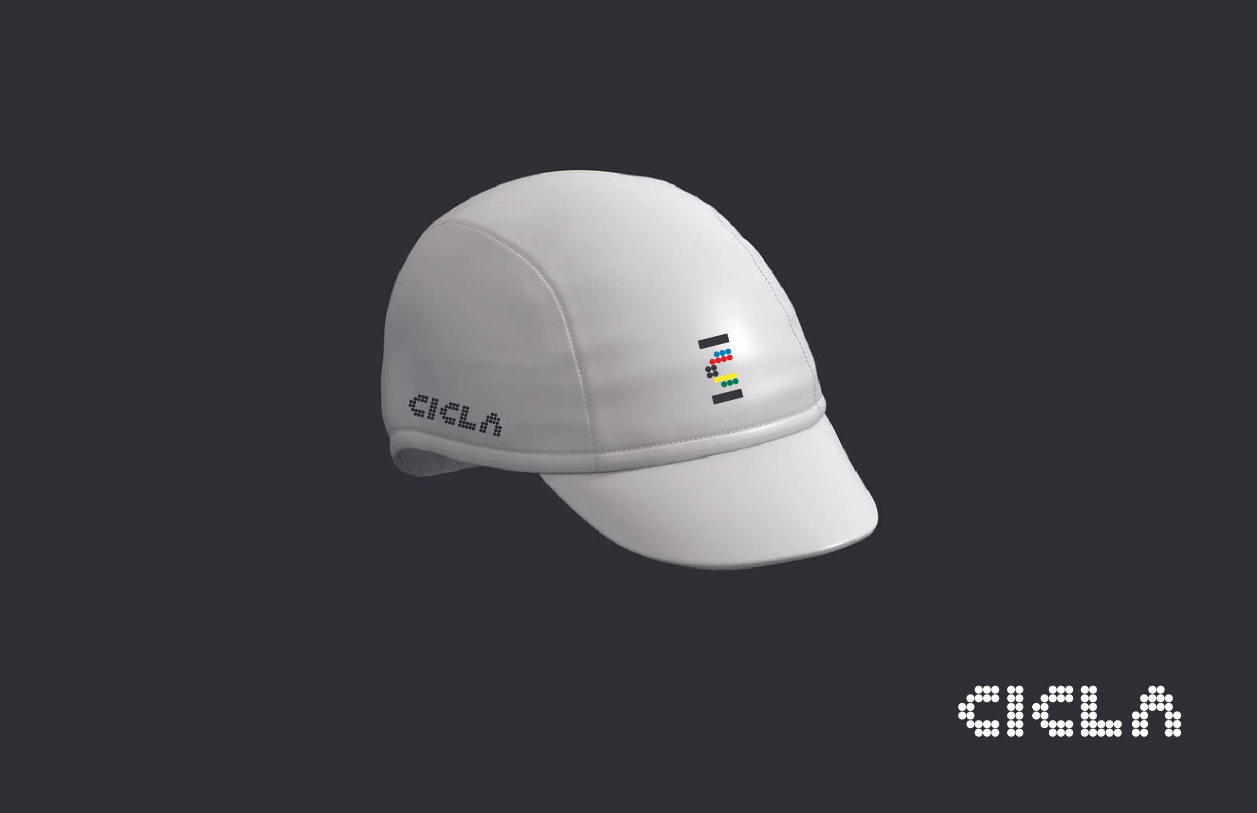
The identity draws heavily from the rhythm and movement of urban cycling. Bold, legible typography and intuitive iconography prioritize clarity and navigation, while a vibrant, internationally-inspired color palette pays homage to the UCI World Championship colors — subtly tying CicLAvia’s local mission to a larger, global cycling community. This decision reflects the idea of CicLAvia International — extending the event’s core values beyond Los Angeles and aligning it with the worldwide movement toward safer, more sustainable streets.